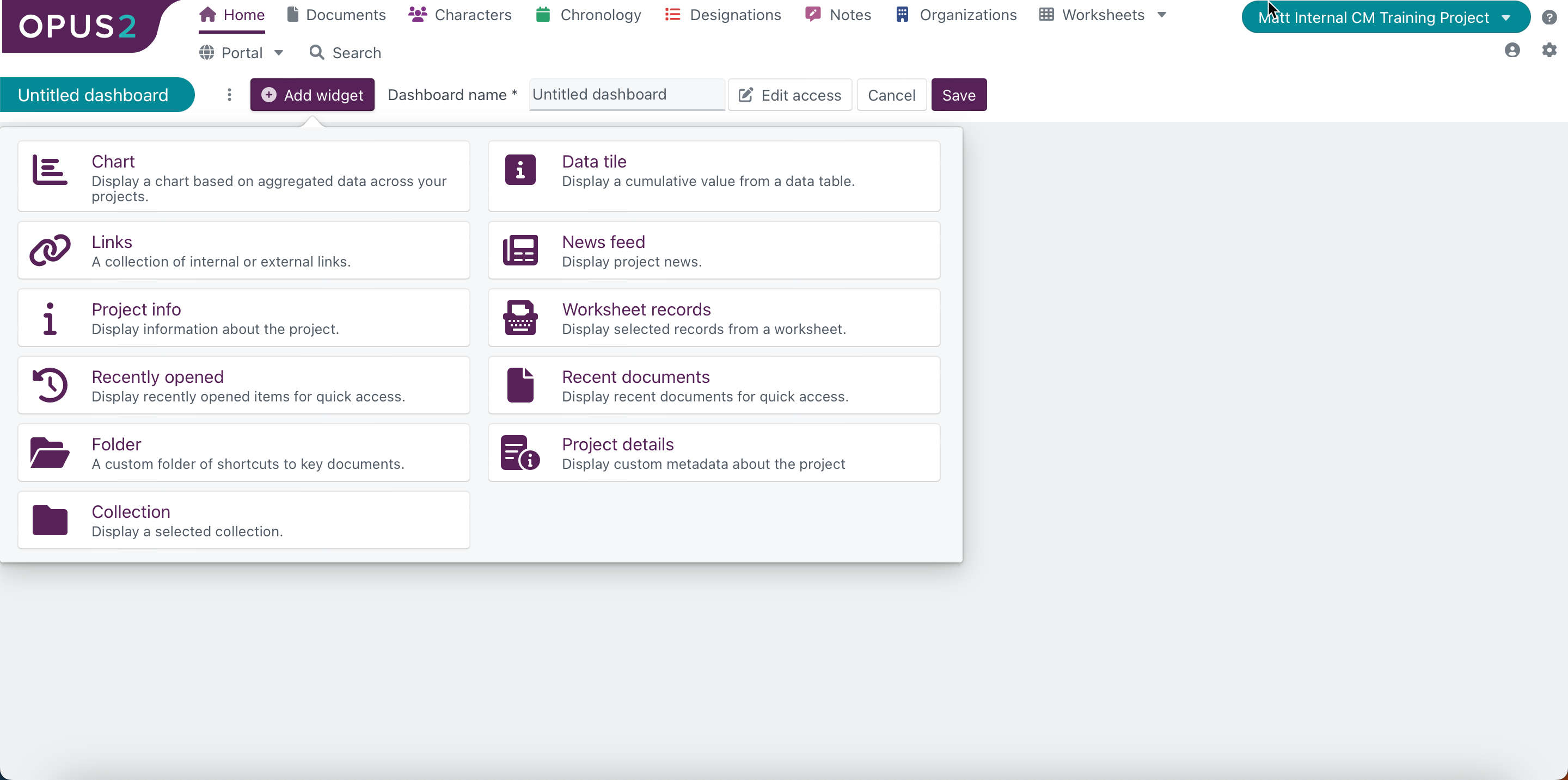
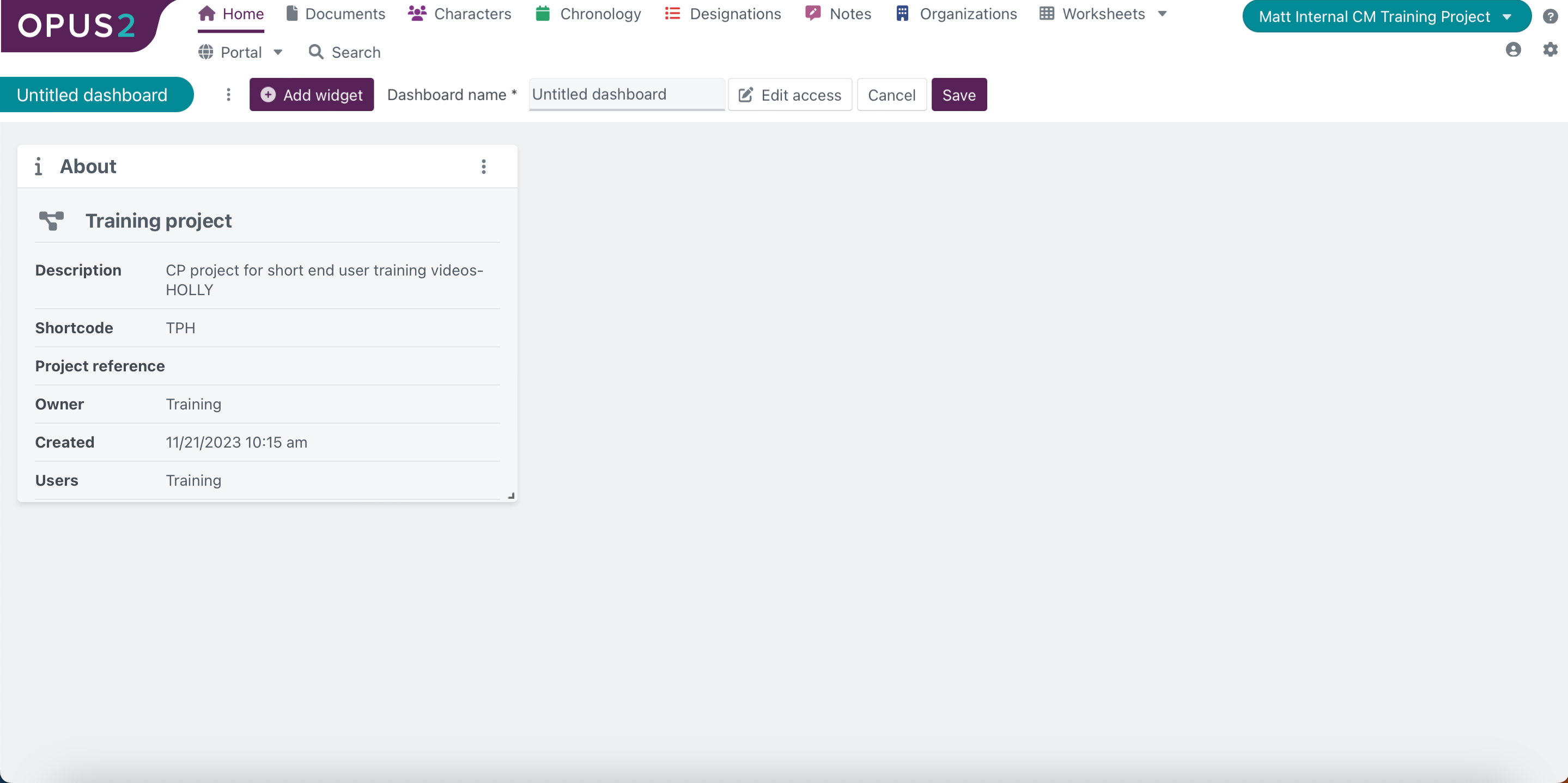
The project dashboard allows users to easily view and manage data related to the project from once central point.
 |
The image above is an example of a configured project dashboard. Users may have been provided with this as their default project dashboard configuration but it is also possible to configure a new project dashboard providing the user has the correct permissions to do so. If a user has been provided with a default project dashboard then this cannot be edited but new dashboards and copies of the default dashboard are editable.
System admin users can set access controls for the dashboards they create.
Option | Explanation | |
|---|---|---|
| Allows users to determine who is able to access the dashboard view. There are three options:
This button is visible only when a user is editing an existing dashboard or creating a new dashboard.
| |
| This allows the user to save a new dashboard configuration or any changes to existing dashboards. |
Widgets are the individual building blocks of visualised data that can be used to build a dashboard in Platform.
 |
Once created, every widget will be displayed with a title entered by the user, and a three-dot icon in the right corner. Clicking on this gives the user two options:
Option | Explanation | |
| Selecting ‘Edit widget’ will return the user to the widget creation dialogue box, populated with the data entered previously. The only widgets that don't have an ‘Edit widget’ option are: Project info., | |
| This allows users to delete the widget from the project dashboard. |
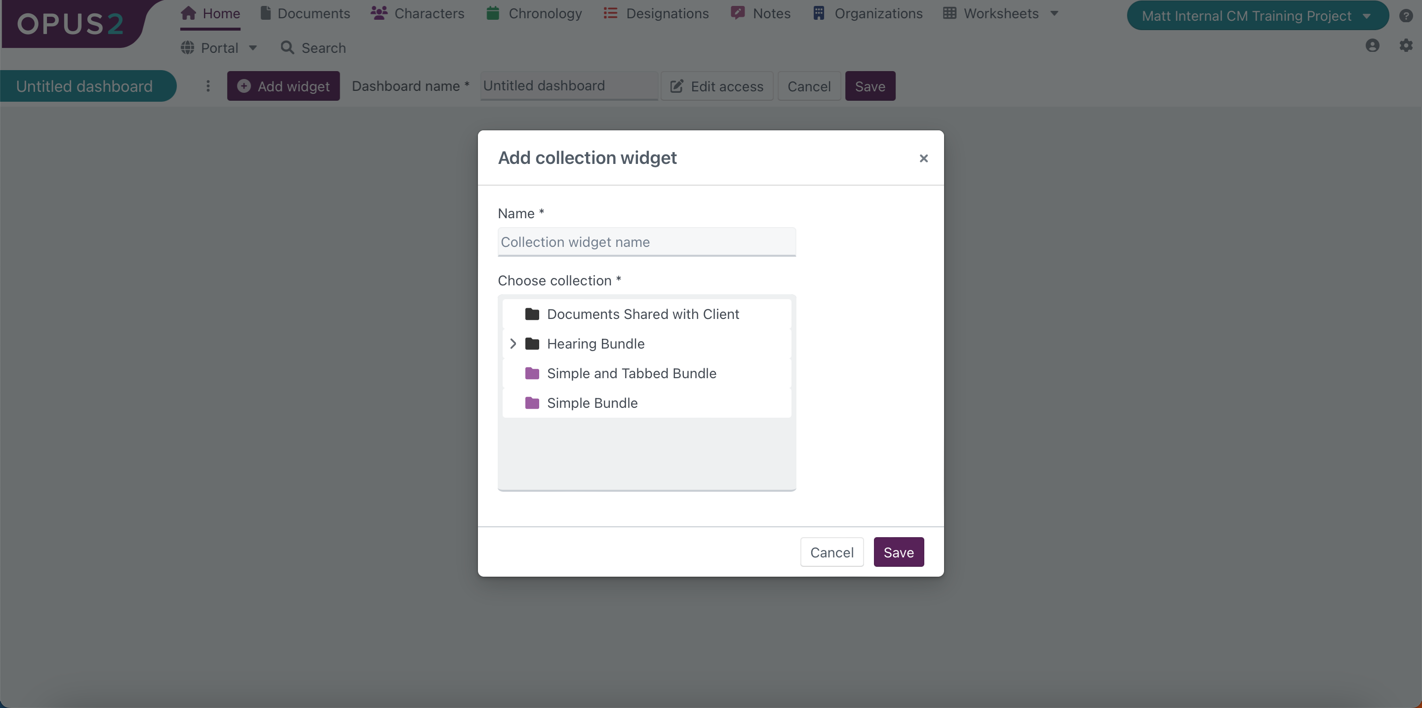
Platform offers 11 widgets for users to configure their project dashboards from. These can be added when editing or creating a new project dashboard.
 |
At the point of adding the widget, the only action that the user can do is select one of their pre-defined charts from the ‘Select chart’ dropdown menu to be added to the dashboard. The chart widget offers users the ability to present visualised data from their project worksheets on their dashboard, creating a quick access point for understanding that data.
Charts themselves are not created from within the ‘Project dashboard’ page, but instead must be created within the ‘Data tables and charts’ page. For more information, please refer to our article on [Data tables and charts].
After saving the selected chart to the widget, it will be displayed on the dashboard as below:
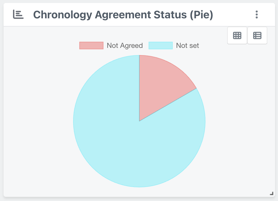 |
There are two icons that appear on the chart widget that can be interacted with:
Icon | Explanation | |
|---|---|---|
| This icon provides a quick link to the worksheet that the chart data was taken from. | |
| This icon changes switches the chart view to a view of the table that the chart was created from. Once it has been selected, the icon will be replaced with this icon |


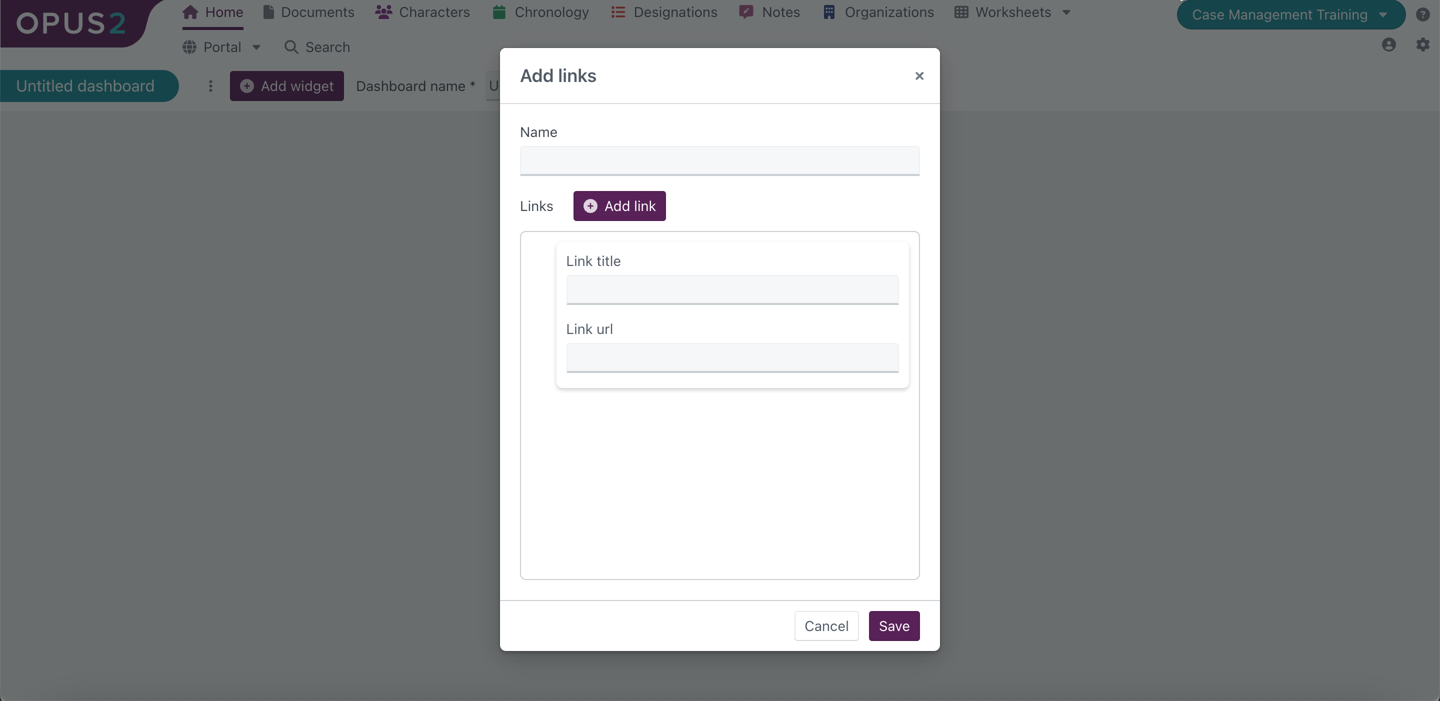 |
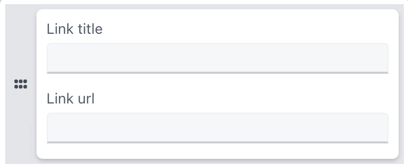
The ‘Links’ widget allows users to link to external sites such as the firms own website or news articles relevant to a particular case.
Option | Explanation | |
|---|---|---|
| Here, the user can enter a name to be displayed at the top of the widget. Users can enter a maximum of 30 characters here. | |
| Selecting this will bring up a link entry box in the ‘Links’ section below it with options to enter a link title and URL. Each link that a user intends to enter must entered in a new link entry box. | |
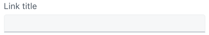
| Users can enter a name to be displayed in the link banner so that users can identify what each link is for. Users can enter a maximum of 30 characters here. | |
| Users can enter the URL of the web page that they intend to link to. Users can enter a maximum of ??? characters here | |
| Users can reorganise the order that the link banners will be displayed in. Hovering over the link entry box will bring up a grey border with six dots on the left side. Clicking and dragging on the left of the grey border allows users to move the link into the intended position. |


After saving the link entires, the completed widget will be displayed on the dashboard as below.
 |
Each link will appear as a banner displaying the title entered by the user. Clicking on the link banner will open the linked web page in a new tab.
 |
The project info widget displays data stored about the project. The displayed data is not interactive or editable. Users can only delete, resize, or reposition the project info widget on the project dashboard.
The data stored on each project includes both user-entered data and system-generated metadata.
The project info widget displays the following project data:
Data | Explanation |
|---|---|
Name | States the name of the project as entered by the user during the creation of the project. The left of the name will display the icon selected by the user during the creation of the project. |
Description | Summarises the project in up to 500 characters. This is entered by the user during the creation of the project. |
Shortcode | Alternative identifier for the project - this is useful when a user has multiple projects with similar names. The shortcode can use up to 6 characters. This is entered by the user during the creation of the project. |
Project reference | What is this used for? The project reference can use up to 50 characters. This is entered by the user during the creation of the project. |
Owner | The username of the user that created the project. This data is automatically stored by Platform when a user creates a new project. |
Created | States the date and time that the project was first created. This data is automatically stored by Platform when a user creates a new project. |
Users | Lists the users that have been given access to the project. Users can be added after a project has been created under the ‘Users’ section of the ‘Project settings’ page. Order of list? |
Template | The project template that was used to create the project. The template is selected by the user during the creation of the project. This will typically include the solution that the instance of Platform is linked to, which is most relevant to internal users at Opus 2 rather than external clients. |
Matter number | what is this? |
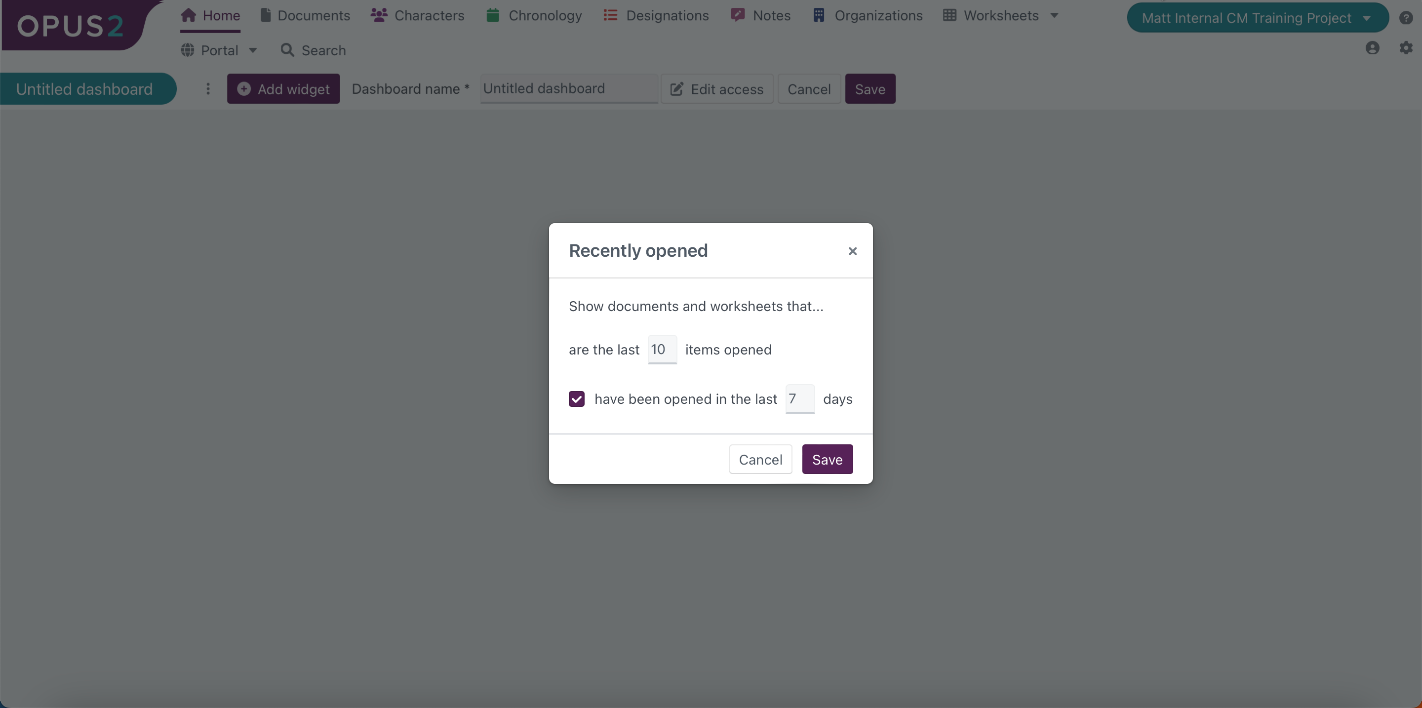 |
The ‘Recently opened’ widget displays a list of both the documents and worksheets within a project that have been opened within a user-defined time period.
Users can determine the time period to display by using the following options:
Option | Explanation | |
|---|---|---|
| Users can specify how many items they wish to be displayed within the widget. The maximum number that can be entered here is 50. If a user enters. number over 50, it will return to 50 when the user clicks out of the text entry box or clicks ‘Save’. | |
| What does this do? | |
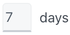
| Users can specify the number of days to be included in the display of recently opened items. The maximum number that can be entered here is 30. If a user enters a number over 30, it will return to 30 when the user clicks out of the text entry box or clicks ‘Save’. |

After saving the 'Recently opened' details, the completed widget will be displayed on the dashboard as below:
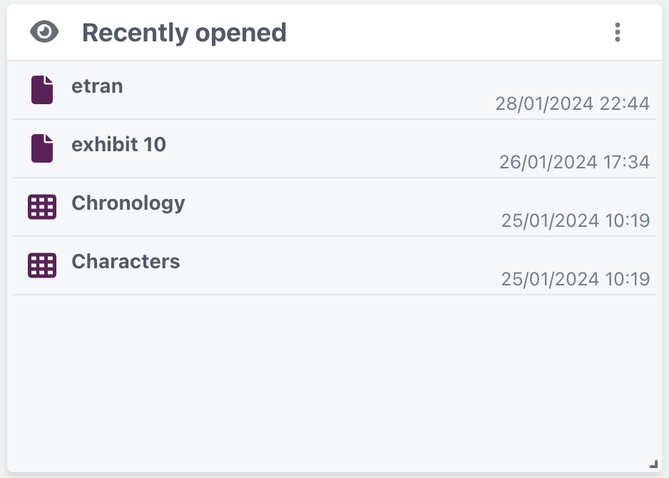 |
Each document and worksheet from the criteria specified will be listed in the widget. Items will be listed in descending order based on the date the item was last opened, so the most recently opened item will be at the top of the list.
All items will be listed with their relevant icon, followed by the item name, then the date and time that the item was most recently opened. Documents will be listed with the page icon  to the left of the item entry, where worksheets will be listed with the grid icon
  to the left of the item entry.
Selecting a document from the widget will redirect the user to the documents page, but will not open the specific document.
Selecting a worksheet will redirect the user to the selected worksheet page.
 |
The ‘Folder’ widget allows users to display the documents that are contained within a specified folder. This helps to provide users with quick access to commonly referenced documents.
The folder must already exist in the Documents page.
The dialogue box for adding the ‘Folder’ widget includes the following options:
Option | Explanation | |
|---|---|---|
| Here, the user can enter a name to be displayed at the top of the widget. Users can enter a maximum of ??? characters here. | |
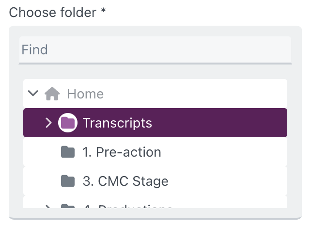
| Displays a list of every folder in the project for the user to select from. Only one folder can be selected per instance of the ‘Folder’ widget. There is a ‘Find’ feature included so users can easily search for their intended folder. | |
| The documents within the selected folder can be filtered further to only show a specific selection of documents. The filter function here offers the same options as the filter function within the Documents page, offering users the ability to filter based on the values of any of the document fields. | |
| Users can select any of the document fields to sort the documents by within the widget. The documents will be sorted alphabetically based on the document name by default. | |
| Users can select whether the documents should be sorted in ascending or descending order based on the field the user has selected. The documents will be sorted in ascending order by default. |

After saving the folder details, the completed widget will be displayed on the dashboard as below:
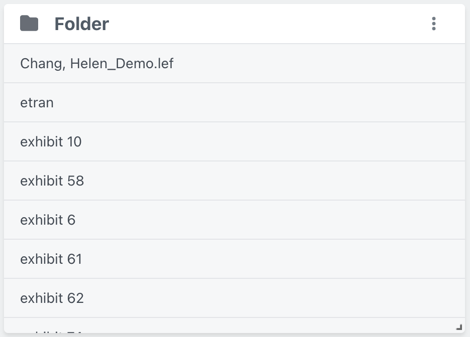 |
Each document from the folder specifications will be listed in the order chosen by the user. Selecting a document from the widget will open the document preview over the dashboard. Redirect users to preview documentation.
 |
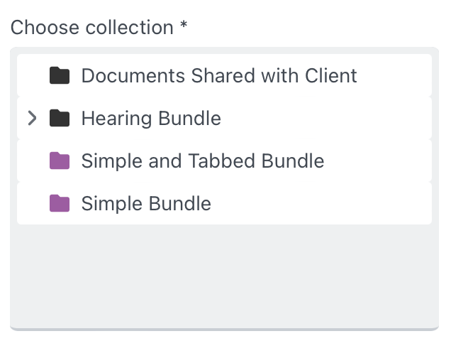
Similar to the ‘Folder’ widget, the ‘Collection’ widget allows users to display the contents of a specified collection.
The collection must already exist in the Documents page.
The dialogue box for adding the ‘Collection’ widget includes the following options:
Option | Explanation | |
|---|---|---|
| Here, the user can enter a name to be displayed at the top of the widget. Users can enter a maximum of ??? characters here. | |
| Displays a list of every collection in the project for the user to select from. Only one collection can be selected per instance of the ‘Collection’ widget. There is a ‘Find’ feature included so users can easily search for their intended collection. |
As with the ‘Folder’ widget, after saving the collection details, the completed widget will be displayed on the dashboard as below:
 |
Each document within the collection will be listed in the widget. Selecting a document from the widget will open the document preview over the dashboard. Redirect users to preview documentation.
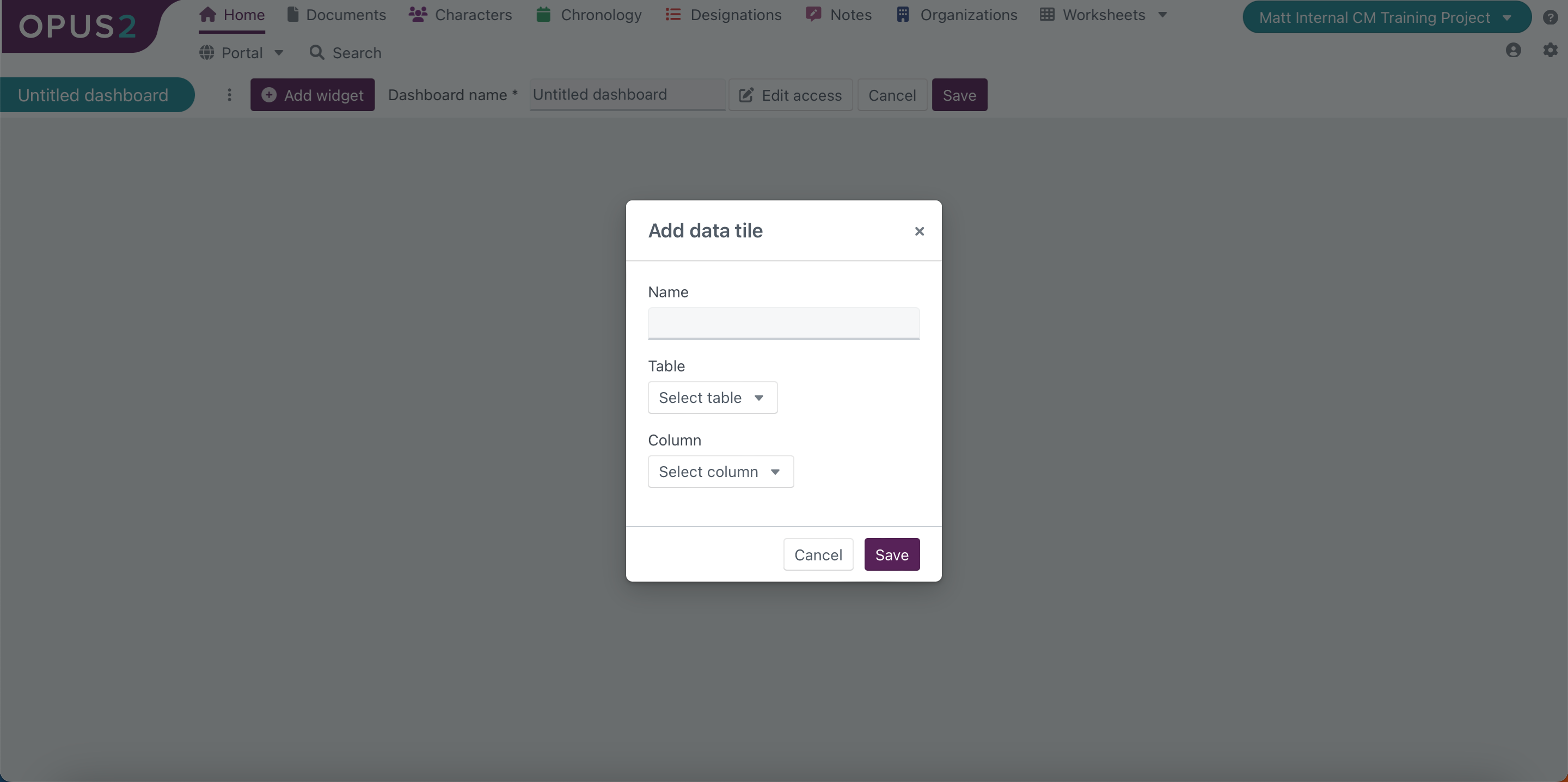 |
The data tile widget allows users to display data on the dashboard as a single numerical record. The data that can be displayed here is pulled from predetermined tables. For instance, a user could create a table which records how many documents are assigned to each user for review, and this data could then be aggregated here to create a data tile which displays to each user how many documents have been assigned to them.
Charts themselves are not created from within the ‘Project dashboard’ page, but instead must be created within the ‘Data tables and charts’ page. For more information, please refer to our article on [Data tables and charts].
 |
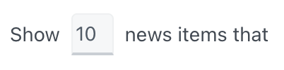
The news feed allows users to display a specified quantity of news items created by a user within the project. News items are ways of communicating updates or other relevant information to users within a project.
Include how to create news items???
Users can determine the time period to display by using the following options:
Option | Explanation | |
|---|---|---|
| Here, the user can enter a name to be displayed at the top of the widget. | |
| Users can specify how many items they wish to be displayed within the widget. The maximum number that can be entered here is 50. If a user enters. number over 50, it will return to 50 when the user clicks out of the text entry box or clicks ‘Save’. | |
| ||
| Users can specify the number of days to be included in the display of recently opened items. The maximum number that can be entered here is 30. If a user enters a number over 30, it will return to 30 when the user clicks out of the text entry box or clicks ‘Save’. |

After saving the news item details, the completed widget will be displayed on the dashboard as below:

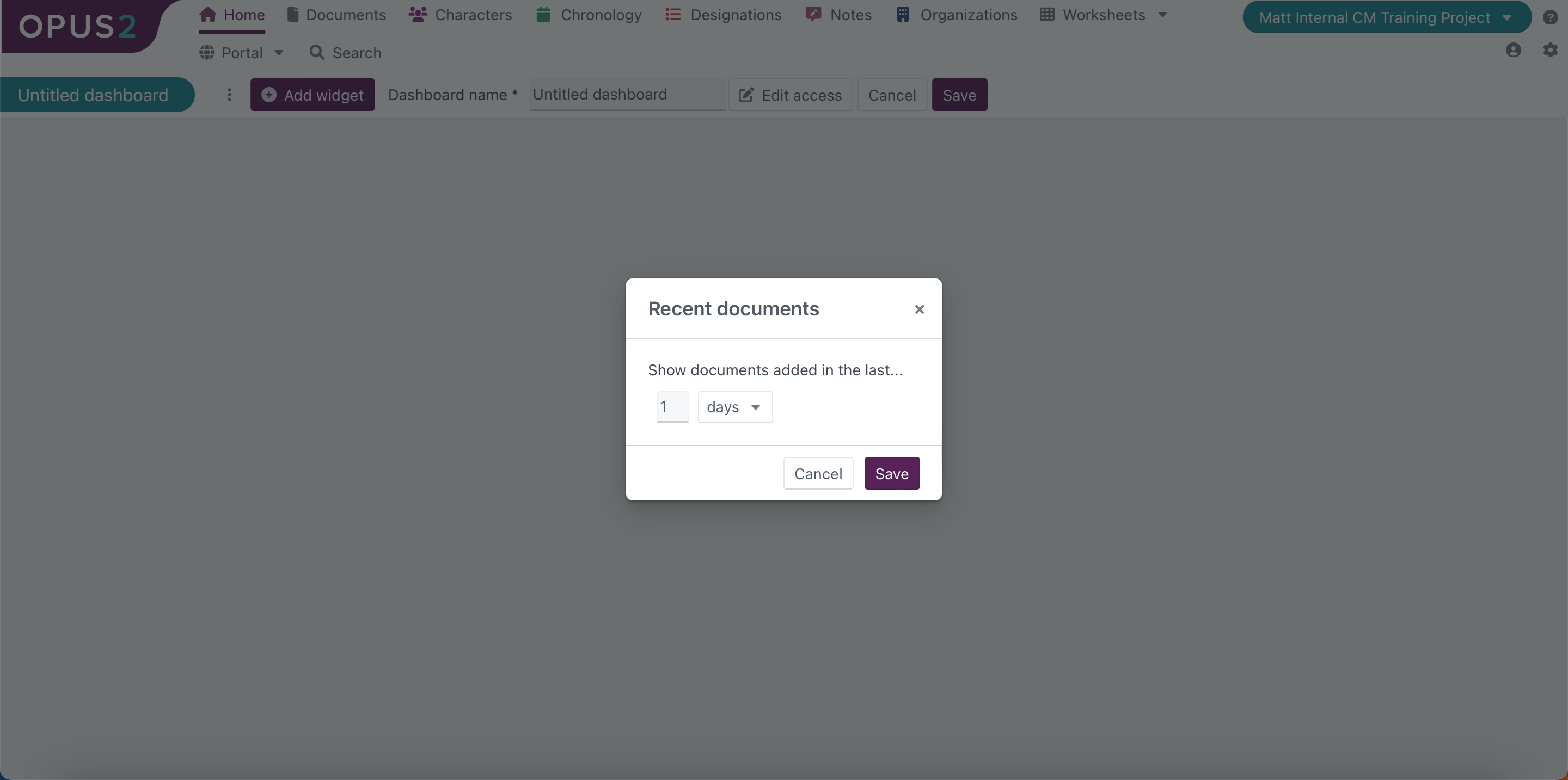 |
The ‘Recent documents’ widget displays a list of the documents that have been added to the project within a user-defined time period.
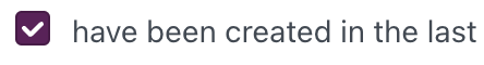
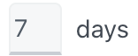
Users can determine the time period to display by using the following options:
Option | Explanation | |
|---|---|---|
| Here, users can freely enter a numerical value to determine the time period to be displayed. The value must be between 1 and 10. | |
| The user can toggle between ‘Days’ and ‘Weeks’ to determine the timeframe that the preceding user-entered numerical value represents. |


After saving the specified time period to be displayed, the completed widget will be displayed on the dashboard as below:
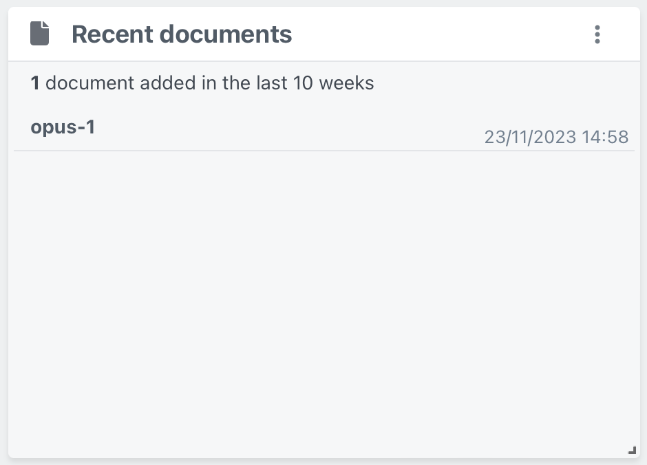 |
Underneath the widget title, the number of documents that have been added to the project within the specified time period will be stated.
Below this, users will find the list of every document that has been added to the project within that period. If the number of documents added exceeds 100 then they will be represented here as ‘More than 100 documents’ rather than the exact number uploaded.
Documents will be listed with the document name followed by their date and time of upload. The list of documents is not interactive, so clicking on a document entry will not open the document or any related details.
Users can only create one instance of this widget and cannot customise the title of the widget.